typo as characters
- xueh jing

- Jul 16, 2019
- 2 min read
for this class, we had an activity to help us warm up to typography. ms sue jane had showed us a range of font types which are totally different from each other. what we had to do was to interpret each font however we think it is. then we are to come up with a character for each of them. pictures below are the characters that i came up with!


Bad Coma gives me a vibe of someone who's rough and laidback at the same time. Even the name itself says it. So, I created a guy who's bald and always wears ragged clothing and has a body full of tattoos. the reason for the ragged clothing was because of the glitchy noise texture that the font has.

Coolvetica looks like a common font that u can see almost anywhere. It reminds me of a computer IT person who would have a strict discipline. to make it ironic, i gave her curly hair that can't be tamed! it kind of reflects opposite to her personality.

Angelina Demo is an elegant font with a touch of maturity to it so I decided to draw an elegant girl who loves to dress up and put makeup. she wears clothes that are trendy yet mature to age. she also loves doing winged eyeliner and perfects it every time.
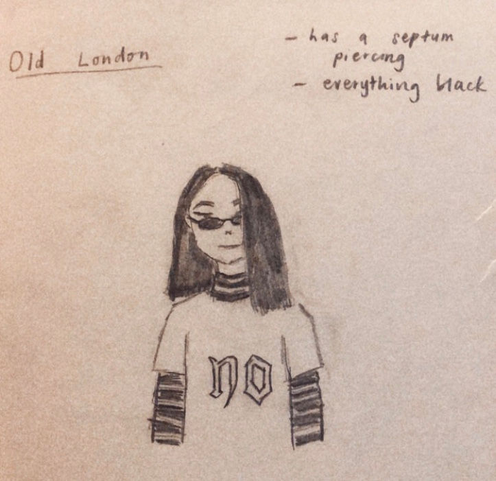
Old London seems to be one of the trendiest fonts today. instead of being known as a common medieval font but this font can also be considered as a font that a lot of people like to use nowadays, which is why I drew a trendy teenage girl.

Sweet Love reminds me of cotton candy and lucky charms! it resembles something sweet and colourful. I drew a girl who loves to wear cute things and collect anything small and cute.


Comments